
Posts tonen met het label Sonja van Vuure. Alle posts tonen
Posts tonen met het label Sonja van Vuure. Alle posts tonen
donderdag 19 april 2012

donderdag 12 april 2012
affordance and educational games
Reading http://paaralan.blogspot.com/2010/09/affordance-and-educational-games.html
An update will soon follow
An update will soon follow
Conceptual Models as Stories
What are conceptual models? I think the easiest way to connive of them is as stories, stories in context. A model is a story that puts the operation of the system into context: it weaves together all of the essential components, providing a framework, a context, and reasons for understanding. Without this story, without this conceptualization, the operation of something becomes a set of memorized actions, but without reason or purpose except "this is how it is done." Although we do operate many of the devices in our lives as learned operations, if there is any complexity to the device at all, then those operations are difficult to learn and prone to error.
Communication & Context: Design as storytelling
The story provides the context that makes the roles of the various accoutrements cleas and distinct. Without the story, without the xontext, their purpose might not be discovered.

For people to use a product succesfully, they must have the same mental model (the users model) as that of the designer (the designers model). But the designer only talks to the user via the product itself. So the entire communication must take place through the system model.
(Norman & Draper's User Centered Design System Design (1986)
De Souza: We need to provide reason to users, not methods (like userguides). This way the user fill find the task of uncovering the conceptual model much easier.
Human beings are explanation machines. We are always trying to understand the world around us, and we make up stories to explain the occurences we experience.
People are spacial. We remember where things are in space.
Reference:
http://www.jnd.org/dn.mss/design_as_communicat.html
Rheinfrank, J., & Evenson, S. (1996). Design Languages. In T. Winograd (Ed.), Bringing design to software (pp. 63-80). New York: Addison-Wesley (ACM Press).
de Souza, C. S. (2005. The Semiotic Engineering of Human Computer Interaction. Cambridge, MA: MIT Press.
Communication & Context: Design as storytelling
The story provides the context that makes the roles of the various accoutrements cleas and distinct. Without the story, without the xontext, their purpose might not be discovered.

For people to use a product succesfully, they must have the same mental model (the users model) as that of the designer (the designers model). But the designer only talks to the user via the product itself. So the entire communication must take place through the system model.
(Norman & Draper's User Centered Design System Design (1986)
De Souza: We need to provide reason to users, not methods (like userguides). This way the user fill find the task of uncovering the conceptual model much easier.
Human beings are explanation machines. We are always trying to understand the world around us, and we make up stories to explain the occurences we experience.
People are spacial. We remember where things are in space.
Reference:
http://www.jnd.org/dn.mss/design_as_communicat.html
Rheinfrank, J., & Evenson, S. (1996). Design Languages. In T. Winograd (Ed.), Bringing design to software (pp. 63-80). New York: Addison-Wesley (ACM Press).
de Souza, C. S. (2005. The Semiotic Engineering of Human Computer Interaction. Cambridge, MA: MIT Press.
dinsdag 10 april 2012
Visual communication of function, affordances or product semantics???
I've asked around, on facebook, classmates, people from different backgrounds, architectures, game designers, interaction designers, game artist, illustrators.. but it is very very very hard to find information about how to create function in your design. My research so far has only been about form, but my research actually is about function. This is not because I'm not aware of this, but because it is very hard to find the information I need about creating function in your design. And I think this is a very big issue. So far during my study, I've learned a lot about creating form and using it to communicate something. This can be seen as a function, but I've never actually learned anything about communicating functions specificly. We all learned this by doing it, using the same tricks we've seen other people doing. If you asked me to design a handle, I would design a proper working handle. But don't ask me what kind of rules or principles I applied to be sure I made the right decisions to communicate the function of the handle.
Point is, I know how to create a function, but I don't understand why exactly it works that way. And I think a lot of people don't know. That is why it is so hard to find information about this subject.
Form follows function, but how DO you design function???
First thing I learned to get to information about this, is don't try to find information with the word function. Use affordances instead.
I've found some interesting articles with this searchword:
http://www.designingforhumans.com/idsa/2007/11/affordances-in.html
http://ieeexplore.ieee.org/xpl/login.jsp?tp=&arnumber=6005281&url=http%3A%2F%2Fieeexplore.ieee.org%2Fxpls%2Fabs_all.jsp%3Farnumber%3D6005281
http://ieeexplore.ieee.org/xpl/login.jsp?tp=&arnumber=5359708&url=http%3A%2F%2Fieeexplore.ieee.org%2Fxpls%2Fabs_all.jsp%3Farnumber%3D5359708
easyprague.cz/presentations/needham.ppt
http://www2.uiah.fi/sefun/DSIU_papers/DSIU%20_%20Kilbourn%20&%20Isaksson%20_%20Meaning%20through%20doing.pdf (!!!)
http://www.idemployee.id.tue.nl/g.w.m.rauterberg/conferences/cd_donotopen/adc/final_paper/105.pdf (theory about what affordances are and what product sematics are, very important)
http://paaralan.blogspot.com/2010/09/affordance-and-educational-games.html (what are affordances, clearly explained)
Interesting knowledge I found
Affordances can also be named action possibilities.
So play affordances can also be named play possibilities. I think this fits.
Again J.J. Gibson's principle of affordances. My next step is to research this principle further.
One of the ongoing "philosophical" points of contention when I was in graduate school was between the cognitive psychologists and the ecological psychologists over the theory of perception.
In a nutshell, the cognitive approach assumes that information in the world is ambiguous and cognitive-perceptual processes are required to interpret stimuli into meaningful information. For example, an object is observed through the visual system and the brain uses that stimulation in conjunction with memory to disambiguate and identify the object. This is in fact how most people understand perception to work.
The minority alternative comes from the ecological perspective ("ecological" as in a rich stimulus environment, and not related to sustainable design), which posits that information in the world is specific and sufficiently detailed to communicate information without any interpretation. That is, the visual stimulus is unique and conveys the relevant characteristics to the observer.
This contrast in approaches also emerged in the world of product and interface design over the term "affordance". The term was coined by J.J. Gibson, the father of ecological psychology, to define the relationship between an actor (e.g. human, animal) and an object or environment. For example, a flat surface "affords" sitting on, a pointy one does not. Note that an affordance is a property that exists whether it is perceived or not or acted on or not.
Product semantics is a tool in product design to generate newer, better and more meaningful forms. Consumer preference and perception of products strongly influence a product's acceptability. Both are expressed by words that may be studied using product semantics.
In Gibson’s theory of perception, an organism directly perceives the value of the environment through
affordances. By affordance, Gibson means the opportunities or possibilities of nature, which require
the act of information pickup. Within design theory, however, there is a strong tendency towards
separating perceptual information of affordances and the affordance itself. Combining theoretical
discussion with an empirical case study of a medical device, we suggest there is untapped value in
the notion of direct perception and argue that there is meaning through doing. Looking at the role
of affordances over time, instead of a person’s first exposure to a product necessitates sensitivity
toward enskilment and how people create meaning through the use of products. (Meaning through doing:
The role of affordances over time, by Kyle Kilbourn and Jessica Isaksson)
Recent years, Gibson's affordance concept has drawn many attentions in the field of
human-computer interface and product design. However, the development of affordance concept in design
practice is by far not yet matured, and the differentiation between affordance and symbolic meaning of designed
artifacts is not clear. As a result, that wrongly exercising the techniques of “Product Semantics” while
implementation of affordance concept is meant is often found in design field. Such confusion not only can
hinder the development of ecological approach in design research, but also limit the potential application of
affordance concept as well.
Conclusion:
The problem is not finding techniques or principles for designing function, but to look what this function communication actually is. It now turns out that the communication of functions can be two things, one (which I already discussed) is 'affordance' and the other one (which is new to me) is 'product semantics'.
-I first need to figure out what function communication is and what an affordance is and what product semantics got to do with this.
When I've done this, I will have my own take on what function communication in toys is and what is important for this.
- Next step will be to look at all the aspect of this communication (done by both ethnography and literal research), make a very big mindmapping brainstorm and try to find a pattern in it. This pattern will (hopefully) bring me to a certain outcome that can tell what elements visual communication of function contain.
- Last step will be how to apply this.
Point is, I know how to create a function, but I don't understand why exactly it works that way. And I think a lot of people don't know. That is why it is so hard to find information about this subject.
Form follows function, but how DO you design function???
First thing I learned to get to information about this, is don't try to find information with the word function. Use affordances instead.
I've found some interesting articles with this searchword:
http://www.designingforhumans.com/idsa/2007/11/affordances-in.html
http://ieeexplore.ieee.org/xpl/login.jsp?tp=&arnumber=6005281&url=http%3A%2F%2Fieeexplore.ieee.org%2Fxpls%2Fabs_all.jsp%3Farnumber%3D6005281
http://ieeexplore.ieee.org/xpl/login.jsp?tp=&arnumber=5359708&url=http%3A%2F%2Fieeexplore.ieee.org%2Fxpls%2Fabs_all.jsp%3Farnumber%3D5359708
easyprague.cz/presentations/needham.ppt
http://www2.uiah.fi/sefun/DSIU_papers/DSIU%20_%20Kilbourn%20&%20Isaksson%20_%20Meaning%20through%20doing.pdf (!!!)
http://www.idemployee.id.tue.nl/g.w.m.rauterberg/conferences/cd_donotopen/adc/final_paper/105.pdf (theory about what affordances are and what product sematics are, very important)
http://paaralan.blogspot.com/2010/09/affordance-and-educational-games.html (what are affordances, clearly explained)
Interesting knowledge I found
Affordances can also be named action possibilities.
So play affordances can also be named play possibilities. I think this fits.
Again J.J. Gibson's principle of affordances. My next step is to research this principle further.
One of the ongoing "philosophical" points of contention when I was in graduate school was between the cognitive psychologists and the ecological psychologists over the theory of perception.
In a nutshell, the cognitive approach assumes that information in the world is ambiguous and cognitive-perceptual processes are required to interpret stimuli into meaningful information. For example, an object is observed through the visual system and the brain uses that stimulation in conjunction with memory to disambiguate and identify the object. This is in fact how most people understand perception to work.
The minority alternative comes from the ecological perspective ("ecological" as in a rich stimulus environment, and not related to sustainable design), which posits that information in the world is specific and sufficiently detailed to communicate information without any interpretation. That is, the visual stimulus is unique and conveys the relevant characteristics to the observer.
This contrast in approaches also emerged in the world of product and interface design over the term "affordance". The term was coined by J.J. Gibson, the father of ecological psychology, to define the relationship between an actor (e.g. human, animal) and an object or environment. For example, a flat surface "affords" sitting on, a pointy one does not. Note that an affordance is a property that exists whether it is perceived or not or acted on or not.
Product semantics is a tool in product design to generate newer, better and more meaningful forms. Consumer preference and perception of products strongly influence a product's acceptability. Both are expressed by words that may be studied using product semantics.
In Gibson’s theory of perception, an organism directly perceives the value of the environment through
affordances. By affordance, Gibson means the opportunities or possibilities of nature, which require
the act of information pickup. Within design theory, however, there is a strong tendency towards
separating perceptual information of affordances and the affordance itself. Combining theoretical
discussion with an empirical case study of a medical device, we suggest there is untapped value in
the notion of direct perception and argue that there is meaning through doing. Looking at the role
of affordances over time, instead of a person’s first exposure to a product necessitates sensitivity
toward enskilment and how people create meaning through the use of products. (Meaning through doing:
The role of affordances over time, by Kyle Kilbourn and Jessica Isaksson)
Recent years, Gibson's affordance concept has drawn many attentions in the field of
human-computer interface and product design. However, the development of affordance concept in design
practice is by far not yet matured, and the differentiation between affordance and symbolic meaning of designed
artifacts is not clear. As a result, that wrongly exercising the techniques of “Product Semantics” while
implementation of affordance concept is meant is often found in design field. Such confusion not only can
hinder the development of ecological approach in design research, but also limit the potential application of
affordance concept as well.
Conclusion:
The problem is not finding techniques or principles for designing function, but to look what this function communication actually is. It now turns out that the communication of functions can be two things, one (which I already discussed) is 'affordance' and the other one (which is new to me) is 'product semantics'.
-I first need to figure out what function communication is and what an affordance is and what product semantics got to do with this.
When I've done this, I will have my own take on what function communication in toys is and what is important for this.
- Next step will be to look at all the aspect of this communication (done by both ethnography and literal research), make a very big mindmapping brainstorm and try to find a pattern in it. This pattern will (hopefully) bring me to a certain outcome that can tell what elements visual communication of function contain.
- Last step will be how to apply this.
woensdag 4 april 2012
By the way
This youtube film was my inspiration for the interactive conducting baton
http://www.youtube.com/watch?v=xrRtx67yPzE

http://www.youtube.com/watch?v=xrRtx67yPzE

Elements of visual design
I've researched the different elements of visual design, so that I can have a better understanding of how I can create affordances in toy designs.
Just like a composer composes his music, a visual designer composes a design. It is important to think about what you want to communicate with the appearance of your product. It is not only about designing something that looks attractive, more important is that your product communicates what it is and what it does. What a visual designer does is create behaviour.
Examples
In Art
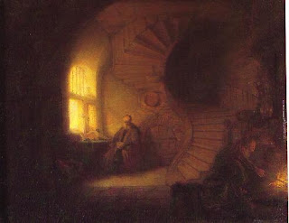
This is a work of Rembrandt, it's called Philosophe en méditation.
It is a very clear example of how an artist uses visual elements to create behaviour. Rembrandt has made this painting so that it draws the attention of the eye in the way he wants to. There are several elements he used for this;
- Warm and cold contrast; the elements in the painting that are warm draw the eye.
- Contrast in size; Some elements in the painting are very big and undifined (the foreground), they are quite boring to look at, so you automatically don't. However, the dark space in the stairs is more interesting to the eye, because the size is contrasting to the stairs and everything around it, because those shapes are smaller and more defined.
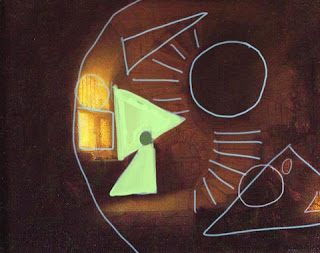
- Contrast in shape; When you look at the painting in a abstract way, everything is devided in shapes. The shapes can point at eachother, or 'block' eachother. In Rembrandts painting you see how he used the contrast between shapes to accentuate the thinking man at the left. He head is a small circle between two big triangles (contrast in both size and shape!). At the right you can see how the direction of the stairsteps points at the person at the fire. If his back (circle) wouldn't overlap the end of the stairs, the dull side of the triangle would 'block' the directing, preventing the eye to go in the direction of the person. But the circle draws in the direction of the steps and in this way it draws the eye.
- Direction. Everything has a direction. When you see an arrow to the right, your eyes automatically follow the arrow to the right.
This can be found back in paintings as well. Direction is a very handy way to create a imaginary line that the eye follows through the painting.
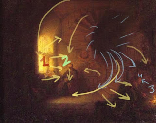
- Tone is one of the most used ways to steer the eye. Your eye is always drawn to light. So if something is more light than the rest you will automatically look at it. Rembrandt was a master in this principle.
In product design

This is one of Staedtler's new markers. The design is based on a painting brush. The new design should allow looser stripes, because the original markers force a very hard grip, which makes tighter stripes. Visually the design explains directly where the product is designed for
- Shape, the shape is like that of a brush, which we all learned to paint with. Also, when using the marker, the shape directs your eye to the paper where you're writing on, it's one big point towards what you're doing.
- Out of the color of the marker you can understand what color inkt the marker has. The rest of the pencil is white, which is a neurtral color, saying that what you can write or make with the marker is only limited to your ideas.
- Direction and Repetition. The three horizontal lines first of all make the whole product more attractive to the eye, because it breaks the whole vertical shape, creating tension in the balance (but not get it out of belance). This makes the look of the product more interesting to look it. It is also a repetition; we like to give relations to things, to understand them better. Repetitions are therefore very fine to look at. It also communicates that it can be used as grip to hold your marker. This element also comes back in the shell of the marker. Here you've got the same repetitive lines, only vertical, which also gives you grip.
Visual design for products can be devided in elements of design and principles of design.
Elements of design are visual pieces that make up a drawing. Principles of design are ways to use elements of design to bring them together in one design.
Elements of design
Line
A fundamental mark or stroke used in drawing in which the length is longer than the width. Two connected points form a line and every line has a length, width, and direction.
You can use lines for design in three ways:
- Contour line: A line that defines or bounds an edge, it could represend a fold, color/tone change or the outline of something.
- Divide space: Use of negative space to define an edge of a space
- Decoration: Lines are used as patterns or stripes to decorate or to create a shadow/tone difference (hatching)
Color
Color plays a very important role in elements of design (it's a researchsubject on itself, so I can't research it as much as I would like to). Color can be used to create drastic contrasts just as hierarchy, size, scale, and dominance can.
Types of color
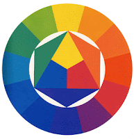
- Primary color: the three basic colors which you can mix and create all the other colors with - blue, red and yellow
- Secondary color: The colors you get when mixing two primary colors: orange, purple and green
- Tertiary color: The colors you get when you mix two secundary colors, of every secundary color you can get a 'warm' tone and a 'cold' tone. For instance; red and purple creates red-purple, which is a warm purple. Blue-purple is a cold purple.
Perceptual attributes of color
Hue: The redness, blueness, greenness (etc.) of a color
Value: How light or dark a color is. You can add black or white to a color. This makes the color lighter or darker, but also 'breaks' the color, reducing the saturation
Saturation: The brightness or dullness of a color.
Ways color can guide the reader
Aid organization with a colorscheme: create a colorscheme/strategy and stay consistent with these colors.
Give emphasis by creating a hierarchy or color that leads to important information (like Rembrandts tone contrast).
Provide direction by creating relationships/contrast between elements. For instance warm en cold. Rembrandt used cold colors for the foreground en warm colors for the background. By creating this contrast people understand that there is a difference between cold and warm.
Shape
A shape is defined as an area that stands out from the space next to or around it due to a defined or implied boundary, or because of differences of value, color, or texture. [Kovalik] All objects are composed of shapes and all other 'Elements of Design' are shapes in some way. There are two kind of shapes:
Geomatric Shapes (Mechanical): These are the shapes that can be drawn using a ruler or compass. Mechanical shapes, wether simple or complex, produce a feeling of control or order.
Organic Shapes: Freehand drawn shapes that are complex and normally found in nature. Organic shapes produce a natural feel.
Texture
Meaning the way a surface feels or is perceived to feel. Texture can be added to attract for repel interest to an element, depending on the pleasantness of the texture. There are two ways to perceive the word 'texture':
Tactile texture: The actual three-dimension feel of a surface that can be touched.
Visual texture: The illusion of the surfaces peaks and valleys on a flat surface. Concept artist, for instance, use photo's of textures in their work to give the illustion of texture.
If a texture repeats a motif it can also be called a pattern.
Space
In design, space is concerned with the are the design will take place on. For a two-dimensional design space concerns creating the illusion of a third dimension on a flat surface.
Ways of creating the illusion of space:
Overlapping: Where objects appear to be on top of each other. This illusion makes the top element look closer to the observer. There is no way to determine the depth of the space, only the order of closeness.
Shading: Adding gradation marks to make an object of a two-dimensional surface seem three-dimensional.
Linear Perspective: A concept relating to how an object seems smaller the farther away it gets.
Atmospheric Perspective: Based on how air acts as a filter to change the appearance of distance objects (a misty environment creates a lot of atmospheric perspective).
Form
Form is any three dimensional object. Form can be measured, from top to bottom (height), side to side (width), and from back to front (depth). Form is also defined by light and dark. There are two types of form, geometric (man-made) and natural (organic form). Form may be created by the combining of two or more shapes. It may be enhanced by tone, texture and color. It can be illustrated or constructed.
Form follows function; Form refers to what something looks like, and function refers to how it works.
Principles of Design [The Elements of Graphic Design, Alex White]
Unity
A good design contains elements that lead the reader through each element in order of significance.
Point, Line, and Plane (PLP)
Balance
Balance in design is the distribution of elements across the design. Balance is a visual interpretation of gravity in the design. Large, dense elements appear to be heavier while smaller elements appear to be lighter. You can balance designs in three ways:
-symmetrical balance: Symmetrical balance is achieved by placing elements in a very even fashion in the design. If you have a large, heavy element on the right side, you'll have a matching heavy element on the left. To prefent the product from becomin too dull (because it's too symmetrical), use different elements on either side to create balance, you don't need to mirror everyting.
-asymmetrical balance: If you think of your design as being on a teeter-totter or seesaw, a lighter element can balance a heavier one by being further away from the center of gravity. You can also use color or texture to balance an asymmetrical design.
-discordant or off-balance: Sometimes the purpose of the design makes an off-balance or discordant design work well. Designs that are off-balance suggest motion and action. They make people uncomfortable or uneasy. If the content of your design is also intended to be uncomfortable or make people think, a discordantly balanced design can work well.
Scale
Using the relative size of elements against each other can attract attention to a focal point. When elements are designed larger than life, scale is being used to show drama.
Dominance
Dominance is created by contrasting size, positioning, color, style, or shape. The focal point should dominate the design with scale and contrast without sacrificing the unity of the whole.
Similarity and Contrast
Some key aspects of a well designed document include dramatic contrasts, scrupulous similarity, and active white space. Planning a consistent and similar design is an important aspect of a designers work to make their focal point visible. Too much similarity is boring but without similarity important elements will not exist. Also, without contrast an image is uneventful so the key is to find the balance between similarity and contrast.
Ways to Develop a Similar Environment
- Less is more: Keep it simple and eliminate clutter. Do not fill white spaces with garbage.
- Build a unique internal organization structure (a wireframe).
- Manipulate shapes of images and text to correlate together, let them interact with eachother.
- Express continuity (stay in line with your style)
- Develop a style manual and stick with the format.
Ways to Create Contrast
Space
-Filled vs Empty
-Near vs Far
-2-D vs 3-D
Position
-Top vs Bottom
-Isolated vs Grouped
-Centered vs Off Center
Form
-Simple vs Complex
-Beauty vs Ugly
-Whole vs Broken
Direction
-Vertical vs Horizontal
-Stability vs Movement
-Convex vs Concave
Structure
-Organized vs Chaotic
-Serif vs Sans Serif
-Mechanical vs Hand Drawn
Size
-Big vs Little
-Long vs Short
-Deep vs. Shallow
Color
-Grayscale vs Color
-Light vs Dark
-Warm vs Cool
Texture
-Fine vs Coarse
-Smooth vs Rough
-Sharp vs Dull
Density
-Transparent vs Opaque
-Thick vs Thin
-Liquid vs Solid
Gravity
-Light vs Heavy
-Stable vs Unstable
Movement
Implying that an object is moving in a direction through space (of the page). This principle suggest speed, instability, or a passing event. Movement seems more dynamic when depth is implied.
Rhythm/Pattern
Rhythm in design is also called repetition. Rhythm allows your designs to develop an internal consistency that makes it easier for your readers to understand. Once the brain recognizes the pattern in the rhythm it can relax and understand the whole design. Repetition rarely occurs on its own and so it embues a sense of order onto the design.
Rule of Thirds and Balance
The rule of thirds says that most designs can be made more interesting by visually dividing the page into thirds vertically and/or horizontally and placing our most important elements within those thirds. Take this concept a step further, especially in photographic composition, by dividing the page into thirds both vertically and horizontally and placing your most important elements at one or more of the four intersections of those lines.
References:
Books:
Visual Design Fundamentals
Alan Hashimoto & Mike Clayton
The Elements of Graphic Design
Alex White
Sketching - The Basics
Roselien Steur
Visual Literacy
Cindy Kovalik and Peggy King
Internet:
http://www.about.com/#!/editors-picks/
Just like a composer composes his music, a visual designer composes a design. It is important to think about what you want to communicate with the appearance of your product. It is not only about designing something that looks attractive, more important is that your product communicates what it is and what it does. What a visual designer does is create behaviour.
Examples
In Art

This is a work of Rembrandt, it's called Philosophe en méditation.
It is a very clear example of how an artist uses visual elements to create behaviour. Rembrandt has made this painting so that it draws the attention of the eye in the way he wants to. There are several elements he used for this;
- Warm and cold contrast; the elements in the painting that are warm draw the eye.
- Contrast in size; Some elements in the painting are very big and undifined (the foreground), they are quite boring to look at, so you automatically don't. However, the dark space in the stairs is more interesting to the eye, because the size is contrasting to the stairs and everything around it, because those shapes are smaller and more defined.
- Contrast in shape; When you look at the painting in a abstract way, everything is devided in shapes. The shapes can point at eachother, or 'block' eachother. In Rembrandts painting you see how he used the contrast between shapes to accentuate the thinking man at the left. He head is a small circle between two big triangles (contrast in both size and shape!). At the right you can see how the direction of the stairsteps points at the person at the fire. If his back (circle) wouldn't overlap the end of the stairs, the dull side of the triangle would 'block' the directing, preventing the eye to go in the direction of the person. But the circle draws in the direction of the steps and in this way it draws the eye.

- Direction. Everything has a direction. When you see an arrow to the right, your eyes automatically follow the arrow to the right.
This can be found back in paintings as well. Direction is a very handy way to create a imaginary line that the eye follows through the painting.

- Tone is one of the most used ways to steer the eye. Your eye is always drawn to light. So if something is more light than the rest you will automatically look at it. Rembrandt was a master in this principle.
In product design

This is one of Staedtler's new markers. The design is based on a painting brush. The new design should allow looser stripes, because the original markers force a very hard grip, which makes tighter stripes. Visually the design explains directly where the product is designed for
- Shape, the shape is like that of a brush, which we all learned to paint with. Also, when using the marker, the shape directs your eye to the paper where you're writing on, it's one big point towards what you're doing.
- Out of the color of the marker you can understand what color inkt the marker has. The rest of the pencil is white, which is a neurtral color, saying that what you can write or make with the marker is only limited to your ideas.
- Direction and Repetition. The three horizontal lines first of all make the whole product more attractive to the eye, because it breaks the whole vertical shape, creating tension in the balance (but not get it out of belance). This makes the look of the product more interesting to look it. It is also a repetition; we like to give relations to things, to understand them better. Repetitions are therefore very fine to look at. It also communicates that it can be used as grip to hold your marker. This element also comes back in the shell of the marker. Here you've got the same repetitive lines, only vertical, which also gives you grip.
Visual design for products can be devided in elements of design and principles of design.
Elements of design are visual pieces that make up a drawing. Principles of design are ways to use elements of design to bring them together in one design.
Elements of design
Line
A fundamental mark or stroke used in drawing in which the length is longer than the width. Two connected points form a line and every line has a length, width, and direction.
You can use lines for design in three ways:
- Contour line: A line that defines or bounds an edge, it could represend a fold, color/tone change or the outline of something.
- Divide space: Use of negative space to define an edge of a space
- Decoration: Lines are used as patterns or stripes to decorate or to create a shadow/tone difference (hatching)
Color
Color plays a very important role in elements of design (it's a researchsubject on itself, so I can't research it as much as I would like to). Color can be used to create drastic contrasts just as hierarchy, size, scale, and dominance can.

Types of color
- Primary color: the three basic colors which you can mix and create all the other colors with - blue, red and yellow
- Secondary color: The colors you get when mixing two primary colors: orange, purple and green
- Tertiary color: The colors you get when you mix two secundary colors, of every secundary color you can get a 'warm' tone and a 'cold' tone. For instance; red and purple creates red-purple, which is a warm purple. Blue-purple is a cold purple.
Perceptual attributes of color
Hue: The redness, blueness, greenness (etc.) of a color
Value: How light or dark a color is. You can add black or white to a color. This makes the color lighter or darker, but also 'breaks' the color, reducing the saturation
Saturation: The brightness or dullness of a color.
Ways color can guide the reader
Aid organization with a colorscheme: create a colorscheme/strategy and stay consistent with these colors.
Give emphasis by creating a hierarchy or color that leads to important information (like Rembrandts tone contrast).
Provide direction by creating relationships/contrast between elements. For instance warm en cold. Rembrandt used cold colors for the foreground en warm colors for the background. By creating this contrast people understand that there is a difference between cold and warm.
Shape
A shape is defined as an area that stands out from the space next to or around it due to a defined or implied boundary, or because of differences of value, color, or texture. [Kovalik] All objects are composed of shapes and all other 'Elements of Design' are shapes in some way. There are two kind of shapes:
Geomatric Shapes (Mechanical): These are the shapes that can be drawn using a ruler or compass. Mechanical shapes, wether simple or complex, produce a feeling of control or order.
Organic Shapes: Freehand drawn shapes that are complex and normally found in nature. Organic shapes produce a natural feel.
Texture
Meaning the way a surface feels or is perceived to feel. Texture can be added to attract for repel interest to an element, depending on the pleasantness of the texture. There are two ways to perceive the word 'texture':
Tactile texture: The actual three-dimension feel of a surface that can be touched.
Visual texture: The illusion of the surfaces peaks and valleys on a flat surface. Concept artist, for instance, use photo's of textures in their work to give the illustion of texture.
If a texture repeats a motif it can also be called a pattern.
Space
In design, space is concerned with the are the design will take place on. For a two-dimensional design space concerns creating the illusion of a third dimension on a flat surface.
Ways of creating the illusion of space:
Overlapping: Where objects appear to be on top of each other. This illusion makes the top element look closer to the observer. There is no way to determine the depth of the space, only the order of closeness.
Shading: Adding gradation marks to make an object of a two-dimensional surface seem three-dimensional.
Linear Perspective: A concept relating to how an object seems smaller the farther away it gets.
Atmospheric Perspective: Based on how air acts as a filter to change the appearance of distance objects (a misty environment creates a lot of atmospheric perspective).
Form
Form is any three dimensional object. Form can be measured, from top to bottom (height), side to side (width), and from back to front (depth). Form is also defined by light and dark. There are two types of form, geometric (man-made) and natural (organic form). Form may be created by the combining of two or more shapes. It may be enhanced by tone, texture and color. It can be illustrated or constructed.
Form follows function; Form refers to what something looks like, and function refers to how it works.
Principles of Design [The Elements of Graphic Design, Alex White]
Unity
A good design contains elements that lead the reader through each element in order of significance.
Point, Line, and Plane (PLP)
Balance
Balance in design is the distribution of elements across the design. Balance is a visual interpretation of gravity in the design. Large, dense elements appear to be heavier while smaller elements appear to be lighter. You can balance designs in three ways:
-symmetrical balance: Symmetrical balance is achieved by placing elements in a very even fashion in the design. If you have a large, heavy element on the right side, you'll have a matching heavy element on the left. To prefent the product from becomin too dull (because it's too symmetrical), use different elements on either side to create balance, you don't need to mirror everyting.
-asymmetrical balance: If you think of your design as being on a teeter-totter or seesaw, a lighter element can balance a heavier one by being further away from the center of gravity. You can also use color or texture to balance an asymmetrical design.
-discordant or off-balance: Sometimes the purpose of the design makes an off-balance or discordant design work well. Designs that are off-balance suggest motion and action. They make people uncomfortable or uneasy. If the content of your design is also intended to be uncomfortable or make people think, a discordantly balanced design can work well.
Scale
Using the relative size of elements against each other can attract attention to a focal point. When elements are designed larger than life, scale is being used to show drama.
Dominance
Dominance is created by contrasting size, positioning, color, style, or shape. The focal point should dominate the design with scale and contrast without sacrificing the unity of the whole.
Similarity and Contrast
Some key aspects of a well designed document include dramatic contrasts, scrupulous similarity, and active white space. Planning a consistent and similar design is an important aspect of a designers work to make their focal point visible. Too much similarity is boring but without similarity important elements will not exist. Also, without contrast an image is uneventful so the key is to find the balance between similarity and contrast.
Ways to Develop a Similar Environment
- Less is more: Keep it simple and eliminate clutter. Do not fill white spaces with garbage.
- Build a unique internal organization structure (a wireframe).
- Manipulate shapes of images and text to correlate together, let them interact with eachother.
- Express continuity (stay in line with your style)
- Develop a style manual and stick with the format.
Ways to Create Contrast
Space
-Filled vs Empty
-Near vs Far
-2-D vs 3-D
Position
-Top vs Bottom
-Isolated vs Grouped
-Centered vs Off Center
Form
-Simple vs Complex
-Beauty vs Ugly
-Whole vs Broken
Direction
-Vertical vs Horizontal
-Stability vs Movement
-Convex vs Concave
Structure
-Organized vs Chaotic
-Serif vs Sans Serif
-Mechanical vs Hand Drawn
Size
-Big vs Little
-Long vs Short
-Deep vs. Shallow
Color
-Grayscale vs Color
-Light vs Dark
-Warm vs Cool
Texture
-Fine vs Coarse
-Smooth vs Rough
-Sharp vs Dull
Density
-Transparent vs Opaque
-Thick vs Thin
-Liquid vs Solid
Gravity
-Light vs Heavy
-Stable vs Unstable
Movement
Implying that an object is moving in a direction through space (of the page). This principle suggest speed, instability, or a passing event. Movement seems more dynamic when depth is implied.
Rhythm/Pattern
Rhythm in design is also called repetition. Rhythm allows your designs to develop an internal consistency that makes it easier for your readers to understand. Once the brain recognizes the pattern in the rhythm it can relax and understand the whole design. Repetition rarely occurs on its own and so it embues a sense of order onto the design.
Rule of Thirds and Balance
The rule of thirds says that most designs can be made more interesting by visually dividing the page into thirds vertically and/or horizontally and placing our most important elements within those thirds. Take this concept a step further, especially in photographic composition, by dividing the page into thirds both vertically and horizontally and placing your most important elements at one or more of the four intersections of those lines.
References:
Books:
Visual Design Fundamentals
Alan Hashimoto & Mike Clayton
The Elements of Graphic Design
Alex White
Sketching - The Basics
Roselien Steur
Visual Literacy
Cindy Kovalik and Peggy King
Internet:
http://www.about.com/#!/editors-picks/
dinsdag 3 april 2012
Working on my presentation
Working on my test mockup presentation for my supervisor, Tarek Atrissi.
It's a very good way of writing down your progress and get a clear view of what you've done and what needs to be done (or what needs to be improved). I'm quite content with it, although I hope I can get another playtest done tomorrow. I'm still waiting for a confirmation of my testclass teacher and I'm waiting for a music loop that is made for the test at the moment.
It's a very good way of writing down your progress and get a clear view of what you've done and what needs to be done (or what needs to be improved). I'm quite content with it, although I hope I can get another playtest done tomorrow. I'm still waiting for a confirmation of my testclass teacher and I'm waiting for a music loop that is made for the test at the moment.
maandag 2 april 2012
Playtest #1
Friday, march 30, I've done my first playtest with the conducting baton.
I went to a school, to a class full of 5 and 6 year olds. I picked three children randomly (two boys and a girl).
I had one conducting baton and I used Griegs' Peer Gynt, At the wedding as test music. I changed the music (tempo and volume) myself according to the movements the children made with the conducting baton (with Virtual DJ). Later on in the test I skipped through the music to active and passive parts of the music.
Out of this first playtest I wanted to learn the following things:
- Do children understand the play affordance I tried to communicate
- What kind of movements do the children make to direct the music (or to simulate a conducter)
- How do children react on the state of music (active/passive)
- Which music system (interaction) works best (tempo/volume or adaptive)
- Does the child has the feeling he or she is influencing the music with the current playtest system
- Do children like the music I've choosen (classical)
- What kind of play affordances can the children get out of this interactive conducting baton
I predicted one leap, which is that the interaction is done by myself, I am the computer. Which means that there is a chance that I can't react fast enough on the movements of the conducting baton. That could make the interaction with the music less clear.
My conclusions out of this first playtest:
- Timing the change of music is very important for clear communication of interaction
- For a clear interaction between player and music, you need clear contrasts in music and the change in music should react accuratly to the movements of the conducting baton.
- Change in tempo is not contrasting enough for children to notice.
- The children make a lot of different movements that are big and active. Most movements look a bit like ballet. Whether this is because of the music genre (classical) needs to be tested.
- When the music is too passive (or when the music stops playing), children interpetet this as a pauze, they wait until the music starts playing more active again as a cue to continue playing.
- The state of the music (passive/active) influences the movements of the children (passive/active, controlled/uncontrolled)
- Children don't like the classical music of Grieg, they think it's old fashioned and prefer theme music from children tv shows like Mega Mindy, Batman and Spiderman.
- Children notice skips in music and perceive these skips als flaws in the music (negatively).
- Children use a lot of space when playing with the conducting baton (to dance and run).
- Children turn and jump with the conducting baton, which needs to be kept in mind during technical design.
- When playing together (with one conducting baton), one child 'conducts' the other children (2 childs) and the other children dance to the music. Or they use the conducting baton as a 'firestick' to blast imaginary fire at eachother. They could also throw the conducting stick over at eachother.
- The basic interaction (the basic play affordance) is always pointing or waving with the conducting baton. So the product design communicates correctly how the player should hold the stick and what movements could be made with it.
Iterations for next playtest:
- Collect different styles of music to look at what kind of music children like best and which music they can have the most fun with.
- Try a new music system: instead of skipping through parts of music or adjusting tempo, mix through two loops of the same musical piece, one passive and one active in equal tempo. In that way I can respond quicker and easier to the movements the child makes with the conducting baton.
Research questions for next playtest:
- Does the style of movement (ballet/...) depend on the style of music that is played (classical/...)
- Do children react on constrast in music
- Do children understand that with high contrast in music and accurate reaction on their moments that they lead the music instead of the other way around
- If the music changes on the next count (which is how real directing works), is that a realistic interaction for the player or not?
I went to a school, to a class full of 5 and 6 year olds. I picked three children randomly (two boys and a girl).
I had one conducting baton and I used Griegs' Peer Gynt, At the wedding as test music. I changed the music (tempo and volume) myself according to the movements the children made with the conducting baton (with Virtual DJ). Later on in the test I skipped through the music to active and passive parts of the music.
Out of this first playtest I wanted to learn the following things:
- Do children understand the play affordance I tried to communicate
- What kind of movements do the children make to direct the music (or to simulate a conducter)
- How do children react on the state of music (active/passive)
- Which music system (interaction) works best (tempo/volume or adaptive)
- Does the child has the feeling he or she is influencing the music with the current playtest system
- Do children like the music I've choosen (classical)
- What kind of play affordances can the children get out of this interactive conducting baton
I predicted one leap, which is that the interaction is done by myself, I am the computer. Which means that there is a chance that I can't react fast enough on the movements of the conducting baton. That could make the interaction with the music less clear.
My conclusions out of this first playtest:
- Timing the change of music is very important for clear communication of interaction
- For a clear interaction between player and music, you need clear contrasts in music and the change in music should react accuratly to the movements of the conducting baton.
- Change in tempo is not contrasting enough for children to notice.
- The children make a lot of different movements that are big and active. Most movements look a bit like ballet. Whether this is because of the music genre (classical) needs to be tested.
- When the music is too passive (or when the music stops playing), children interpetet this as a pauze, they wait until the music starts playing more active again as a cue to continue playing.
- The state of the music (passive/active) influences the movements of the children (passive/active, controlled/uncontrolled)
- Children don't like the classical music of Grieg, they think it's old fashioned and prefer theme music from children tv shows like Mega Mindy, Batman and Spiderman.
- Children notice skips in music and perceive these skips als flaws in the music (negatively).
- Children use a lot of space when playing with the conducting baton (to dance and run).
- Children turn and jump with the conducting baton, which needs to be kept in mind during technical design.
- When playing together (with one conducting baton), one child 'conducts' the other children (2 childs) and the other children dance to the music. Or they use the conducting baton as a 'firestick' to blast imaginary fire at eachother. They could also throw the conducting stick over at eachother.
- The basic interaction (the basic play affordance) is always pointing or waving with the conducting baton. So the product design communicates correctly how the player should hold the stick and what movements could be made with it.
Iterations for next playtest:
- Collect different styles of music to look at what kind of music children like best and which music they can have the most fun with.
- Try a new music system: instead of skipping through parts of music or adjusting tempo, mix through two loops of the same musical piece, one passive and one active in equal tempo. In that way I can respond quicker and easier to the movements the child makes with the conducting baton.
Research questions for next playtest:
- Does the style of movement (ballet/...) depend on the style of music that is played (classical/...)
- Do children react on constrast in music
- Do children understand that with high contrast in music and accurate reaction on their moments that they lead the music instead of the other way around
- If the music changes on the next count (which is how real directing works), is that a realistic interaction for the player or not?
vrijdag 30 maart 2012
Update
Last week, I was unable to walk, so I worked at home. I've focused on my supportive narrative and my proposal.
I rewrote my proposal because I realized that my current research question was not really focussing on what I have been studying for the last three and a half years. I studying game art and all of the sudden I want to research toy design. Which is possible of course, but I think it is more interesting for me as a visual designer to focus on visual design. This way my study, project and research comes more together. My old research question was: 'does the amount of play affordances correlates with 'better' toys?'. Which to me is a fine research question, but it is too much focused on play design. I want to study the visual side of toys for this project, but I'm still very interested in affordances.
So my new question is: 'How can visual design in toys trigger play affordances and manipulate play behaviour?'. I'm going to research how visual design triggers actions, so it's all about communication in visual design. And I think this is very similar to the way you need to communicate in game art, or actually every other way of interaction and product design. So I'm planning to look at other products and how they are designed visually, what they use to communicate how people should interact with it.
I rewrote my proposal because I realized that my current research question was not really focussing on what I have been studying for the last three and a half years. I studying game art and all of the sudden I want to research toy design. Which is possible of course, but I think it is more interesting for me as a visual designer to focus on visual design. This way my study, project and research comes more together. My old research question was: 'does the amount of play affordances correlates with 'better' toys?'. Which to me is a fine research question, but it is too much focused on play design. I want to study the visual side of toys for this project, but I'm still very interested in affordances.
So my new question is: 'How can visual design in toys trigger play affordances and manipulate play behaviour?'. I'm going to research how visual design triggers actions, so it's all about communication in visual design. And I think this is very similar to the way you need to communicate in game art, or actually every other way of interaction and product design. So I'm planning to look at other products and how they are designed visually, what they use to communicate how people should interact with it.

dinsdag 20 maart 2012
First prototype Interactive conducting baton

This is the first prototype of the Interactive conducting baton.
It's made of wood and griptape. It is 30cm long.
At the moment I'm downloading several dj programs to see which one is best suitable for my first playtest.
In the first playtest I'm going to test this prototype with 6 year olds. I will play Griegs Peer Gynt nr.01 At the wedding. According to the movements the tester will make with the baton, I will adjust volume and tempo.
I've talked with composers Stan Koch, composer/non-linear music strategist Than van Nispen and sonic designer Laurens van der Wee about my concept and ways I could children let interact with the music.
Out of these talks I came to three concepts children can interact with the baton:
1: Volume/gain and tempo. The music will be linear. The tempo will adjust according to the tempo the child will sway with the baton. Volume will adjust according to how big the movement is. This is a very simple concept, but the composers predicted this way of interaction shall be interesting enough for children to play with the music.
2: Percussion, blowers, strings. The child can point in a certain direction to address percussions, blowers or strings and can make these instruments play harder or softer. The musical system will work in layers of percussion, blowers and strings.
3: Busy parts, quiet parts. According to the movement of the child (busy or quiet), a system will choose a quiet or a busy part of a composition. This will be a non-linear music system.
dinsdag 13 maart 2012
Concept: Interactive conducting baton

I love to see how children respond to music. They start to dance on it instinctually or move their arms to conduct the music. I though it would be a great idea to create an interactive conducting baton that reacts on movement by producing tones of different instruments.
Concept: Sleevy's

These hand dolls are designed so that they can make sounds by using your fingers/opening or closing their mouth.
Concept: Sleepy hero's

These enlightening little creatures beat every alligator underneath your child's bed. Your kids can take them to their bed at night and they will lighten up like a light lamp. They are also very cuddly instead of those hard barely playaffordable night lamp creatures.
maandag 12 maart 2012
Wild Wacky Action Bike
http://www.youtube.com/watch?v=1qPM7WK9e_Y
Now what exactly was the intended play affordance for this toy??? ;)
Now what exactly was the intended play affordance for this toy??? ;)
woensdag 7 maart 2012
Concept: Little Soapies

I got the idea for this concept when I read my blogpost about the discussion with media students about what a book is. One of them said that one of the fun factors of a book was to collect and that it was tangible. Kids make up the most amazing stories with their dolls. Kids use their imagination to experiment with different scenes or review a experience. What if you added some kind of Sim element to these dolls? Making them interactive, let them build up relationships, let them experience with social interactions. I used an Ipad 2 for this concept, but this would also work on your computer with a camera.
So this is actually some kind of app, but you can collect dolls and play with them in a analog way.
dinsdag 6 maart 2012
Design Play Studio about play affordances
http://www.designplaystudio.com/?p=658
A very interesting blogpost by Sheila from Design Play Studio. She states that toys should be simple to allow children to 'do things'.
She arguments this by explaining two theories; Architect Simon Nicholson’s Theory of Loose Parts and psychologist James J. Gibson’s Theory of Affordances.
Nicholson's Theory of Loose Parts:
'in any environment, both the degree of inventiveness and creativity and the possibilities of discovery are directly proportional to the number and kind of variables in it.'
In short: the more stuff there is to experiment with, the more experimenting one can do.
We see the opposite of this quite a bit in toys and playspaces designed for children. For example, if a playground or exhibit has all fixed components with only one or two ways they can be manipulated, then there are usually about one or two things children can do or learn. In Sheila's experience, these fixed components are often broken by children who are interpreting a hands-on design as something to use when it was actually only intended to demonstrate. The most successful exhibits and spaces for children are those that support children in playing, experimenting and learning. To do so, they must have props and loose parts that can be manipulated in creative (not just predetermined) ways.
Gibson's Theory of Affordances:
By his definition, an affordance is a “quality of an object, or an environment, that allows an individual to perform an action.”
For example, a tree is climbable only when it’s of a scale that the person assessing it can climb. It is a functional view of the built and natural environment and this functional perspective is how children assess the world around them. Children view the physical world through affordances. Simply stated, what does the environment offer me the ability to do? Ever wonder why kids climb on statues, benches, and other things they “shouldn’t?” Its because if the object is scaled so that a child can climb it a child reads the object as climbable, or for climbing. It’s a really different way of looking at the world than how us adults do, and makes a lot of sense once you open your eyes to it (although every skateboarder I know still views the world this way). So, what does this mean for design? In my experience, this means that the best designs for children are developed from a functional framework. The process begins by asking “what is it that we want children to be able to do here, and how to we make sure that this environment supports these actions?” This may sound obvious, but if form is held above function, an exhibit or toy can end up looking very flashy and sophisticated and fool us adults into thinking it supports a child’s learning. On first glance however, children quickly assess whether or not it supports action and experimentation. And as children learn best by doing, supporting these pursuits is no small matter.
Don Norman expains affordances

LINK TO YOUTUBE
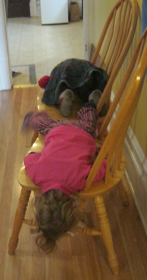
This video was made in 1994, but it is still very relevant today. Norman explains what affordances are. Play affordances work the same. A toy is a 'thing' that has at least one play affordance (a way to play with the object). If a toy has at least one play affordance, it is a toy. If it hasn't got play affordance, it isn't a toy. It would sound logical that a toy with more play affordances is a better toy, but it is not proved yet. I would like to find out if more play affordances correlates with better toys. I think this would be a good subject to write my supportive narrative about.
Affordances can be different depending on how big you are. A chair affordance sitting for adults, but when you are 3 years old, you're way smaller and a chair would be more interesting to climb and stand on (ofcourse sitting will still be an affordance as well).
http://rethinkingchildhood.com/2012/01/30/affordance/
donderdag 1 maart 2012
Concept: The Beatlies
A mix between fantasy, sensory and constructionplay (and maybe even a little challange play, but not intended): The Beatlies. You can collect these dolls, they're one big family and they love to make noise. A Beatly is very cute and active and makes his own noise/beat. But when you put him together with other Beatlies, the fun really starts. Combining different Beatlies means combining different 'sounds' to make your own beat.


Abonneren op:
Posts (Atom)