Just like a composer composes his music, a visual designer composes a design. It is important to think about what you want to communicate with the appearance of your product. It is not only about designing something that looks attractive, more important is that your product communicates what it is and what it does. What a visual designer does is create behaviour.
Examples
In Art

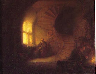
This is a work of Rembrandt, it's called Philosophe en méditation.
It is a very clear example of how an artist uses visual elements to create behaviour. Rembrandt has made this painting so that it draws the attention of the eye in the way he wants to. There are several elements he used for this;
- Warm and cold contrast; the elements in the painting that are warm draw the eye.
- Contrast in size; Some elements in the painting are very big and undifined (the foreground), they are quite boring to look at, so you automatically don't. However, the dark space in the stairs is more interesting to the eye, because the size is contrasting to the stairs and everything around it, because those shapes are smaller and more defined.
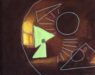
- Contrast in shape; When you look at the painting in a abstract way, everything is devided in shapes. The shapes can point at eachother, or 'block' eachother. In Rembrandts painting you see how he used the contrast between shapes to accentuate the thinking man at the left. He head is a small circle between two big triangles (contrast in both size and shape!). At the right you can see how the direction of the stairsteps points at the person at the fire. If his back (circle) wouldn't overlap the end of the stairs, the dull side of the triangle would 'block' the directing, preventing the eye to go in the direction of the person. But the circle draws in the direction of the steps and in this way it draws the eye.

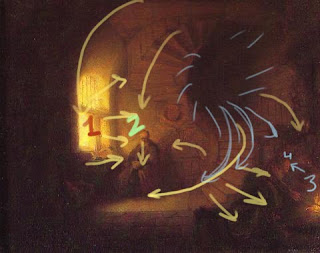
- Direction. Everything has a direction. When you see an arrow to the right, your eyes automatically follow the arrow to the right.
This can be found back in paintings as well. Direction is a very handy way to create a imaginary line that the eye follows through the painting.

- Tone is one of the most used ways to steer the eye. Your eye is always drawn to light. So if something is more light than the rest you will automatically look at it. Rembrandt was a master in this principle.
In product design

This is one of Staedtler's new markers. The design is based on a painting brush. The new design should allow looser stripes, because the original markers force a very hard grip, which makes tighter stripes. Visually the design explains directly where the product is designed for
- Shape, the shape is like that of a brush, which we all learned to paint with. Also, when using the marker, the shape directs your eye to the paper where you're writing on, it's one big point towards what you're doing.
- Out of the color of the marker you can understand what color inkt the marker has. The rest of the pencil is white, which is a neurtral color, saying that what you can write or make with the marker is only limited to your ideas.
- Direction and Repetition. The three horizontal lines first of all make the whole product more attractive to the eye, because it breaks the whole vertical shape, creating tension in the balance (but not get it out of belance). This makes the look of the product more interesting to look it. It is also a repetition; we like to give relations to things, to understand them better. Repetitions are therefore very fine to look at. It also communicates that it can be used as grip to hold your marker. This element also comes back in the shell of the marker. Here you've got the same repetitive lines, only vertical, which also gives you grip.
Visual design for products can be devided in elements of design and principles of design.
Elements of design are visual pieces that make up a drawing. Principles of design are ways to use elements of design to bring them together in one design.
Elements of design
Line
A fundamental mark or stroke used in drawing in which the length is longer than the width. Two connected points form a line and every line has a length, width, and direction.
You can use lines for design in three ways:
- Contour line: A line that defines or bounds an edge, it could represend a fold, color/tone change or the outline of something.
- Divide space: Use of negative space to define an edge of a space
- Decoration: Lines are used as patterns or stripes to decorate or to create a shadow/tone difference (hatching)
Color
Color plays a very important role in elements of design (it's a researchsubject on itself, so I can't research it as much as I would like to). Color can be used to create drastic contrasts just as hierarchy, size, scale, and dominance can.

Types of color
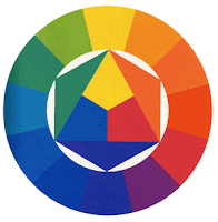
- Primary color: the three basic colors which you can mix and create all the other colors with - blue, red and yellow
- Secondary color: The colors you get when mixing two primary colors: orange, purple and green
- Tertiary color: The colors you get when you mix two secundary colors, of every secundary color you can get a 'warm' tone and a 'cold' tone. For instance; red and purple creates red-purple, which is a warm purple. Blue-purple is a cold purple.
Perceptual attributes of color
Hue: The redness, blueness, greenness (etc.) of a color
Value: How light or dark a color is. You can add black or white to a color. This makes the color lighter or darker, but also 'breaks' the color, reducing the saturation
Saturation: The brightness or dullness of a color.
Ways color can guide the reader
Aid organization with a colorscheme: create a colorscheme/strategy and stay consistent with these colors.
Give emphasis by creating a hierarchy or color that leads to important information (like Rembrandts tone contrast).
Provide direction by creating relationships/contrast between elements. For instance warm en cold. Rembrandt used cold colors for the foreground en warm colors for the background. By creating this contrast people understand that there is a difference between cold and warm.
Shape
A shape is defined as an area that stands out from the space next to or around it due to a defined or implied boundary, or because of differences of value, color, or texture. [Kovalik] All objects are composed of shapes and all other 'Elements of Design' are shapes in some way. There are two kind of shapes:
Geomatric Shapes (Mechanical): These are the shapes that can be drawn using a ruler or compass. Mechanical shapes, wether simple or complex, produce a feeling of control or order.
Organic Shapes: Freehand drawn shapes that are complex and normally found in nature. Organic shapes produce a natural feel.
Texture
Meaning the way a surface feels or is perceived to feel. Texture can be added to attract for repel interest to an element, depending on the pleasantness of the texture. There are two ways to perceive the word 'texture':
Tactile texture: The actual three-dimension feel of a surface that can be touched.
Visual texture: The illusion of the surfaces peaks and valleys on a flat surface. Concept artist, for instance, use photo's of textures in their work to give the illustion of texture.
If a texture repeats a motif it can also be called a pattern.
Space
In design, space is concerned with the are the design will take place on. For a two-dimensional design space concerns creating the illusion of a third dimension on a flat surface.
Ways of creating the illusion of space:
Overlapping: Where objects appear to be on top of each other. This illusion makes the top element look closer to the observer. There is no way to determine the depth of the space, only the order of closeness.
Shading: Adding gradation marks to make an object of a two-dimensional surface seem three-dimensional.
Linear Perspective: A concept relating to how an object seems smaller the farther away it gets.
Atmospheric Perspective: Based on how air acts as a filter to change the appearance of distance objects (a misty environment creates a lot of atmospheric perspective).
Form
Form is any three dimensional object. Form can be measured, from top to bottom (height), side to side (width), and from back to front (depth). Form is also defined by light and dark. There are two types of form, geometric (man-made) and natural (organic form). Form may be created by the combining of two or more shapes. It may be enhanced by tone, texture and color. It can be illustrated or constructed.
Form follows function; Form refers to what something looks like, and function refers to how it works.
Principles of Design [The Elements of Graphic Design, Alex White]
Unity
A good design contains elements that lead the reader through each element in order of significance.
Point, Line, and Plane (PLP)
Balance
Balance in design is the distribution of elements across the design. Balance is a visual interpretation of gravity in the design. Large, dense elements appear to be heavier while smaller elements appear to be lighter. You can balance designs in three ways:
-symmetrical balance: Symmetrical balance is achieved by placing elements in a very even fashion in the design. If you have a large, heavy element on the right side, you'll have a matching heavy element on the left. To prefent the product from becomin too dull (because it's too symmetrical), use different elements on either side to create balance, you don't need to mirror everyting.
-asymmetrical balance: If you think of your design as being on a teeter-totter or seesaw, a lighter element can balance a heavier one by being further away from the center of gravity. You can also use color or texture to balance an asymmetrical design.
-discordant or off-balance: Sometimes the purpose of the design makes an off-balance or discordant design work well. Designs that are off-balance suggest motion and action. They make people uncomfortable or uneasy. If the content of your design is also intended to be uncomfortable or make people think, a discordantly balanced design can work well.
Scale
Using the relative size of elements against each other can attract attention to a focal point. When elements are designed larger than life, scale is being used to show drama.
Dominance
Dominance is created by contrasting size, positioning, color, style, or shape. The focal point should dominate the design with scale and contrast without sacrificing the unity of the whole.
Similarity and Contrast
Some key aspects of a well designed document include dramatic contrasts, scrupulous similarity, and active white space. Planning a consistent and similar design is an important aspect of a designers work to make their focal point visible. Too much similarity is boring but without similarity important elements will not exist. Also, without contrast an image is uneventful so the key is to find the balance between similarity and contrast.
Ways to Develop a Similar Environment
- Less is more: Keep it simple and eliminate clutter. Do not fill white spaces with garbage.
- Build a unique internal organization structure (a wireframe).
- Manipulate shapes of images and text to correlate together, let them interact with eachother.
- Express continuity (stay in line with your style)
- Develop a style manual and stick with the format.
Ways to Create Contrast
Space
-Filled vs Empty
-Near vs Far
-2-D vs 3-D
Position
-Top vs Bottom
-Isolated vs Grouped
-Centered vs Off Center
Form
-Simple vs Complex
-Beauty vs Ugly
-Whole vs Broken
Direction
-Vertical vs Horizontal
-Stability vs Movement
-Convex vs Concave
Structure
-Organized vs Chaotic
-Serif vs Sans Serif
-Mechanical vs Hand Drawn
Size
-Big vs Little
-Long vs Short
-Deep vs. Shallow
Color
-Grayscale vs Color
-Light vs Dark
-Warm vs Cool
Texture
-Fine vs Coarse
-Smooth vs Rough
-Sharp vs Dull
Density
-Transparent vs Opaque
-Thick vs Thin
-Liquid vs Solid
Gravity
-Light vs Heavy
-Stable vs Unstable
Movement
Implying that an object is moving in a direction through space (of the page). This principle suggest speed, instability, or a passing event. Movement seems more dynamic when depth is implied.
Rhythm/Pattern
Rhythm in design is also called repetition. Rhythm allows your designs to develop an internal consistency that makes it easier for your readers to understand. Once the brain recognizes the pattern in the rhythm it can relax and understand the whole design. Repetition rarely occurs on its own and so it embues a sense of order onto the design.
Rule of Thirds and Balance
The rule of thirds says that most designs can be made more interesting by visually dividing the page into thirds vertically and/or horizontally and placing our most important elements within those thirds. Take this concept a step further, especially in photographic composition, by dividing the page into thirds both vertically and horizontally and placing your most important elements at one or more of the four intersections of those lines.
References:
Books:
Visual Design Fundamentals
Alan Hashimoto & Mike Clayton
The Elements of Graphic Design
Alex White
Sketching - The Basics
Roselien Steur
Visual Literacy
Cindy Kovalik and Peggy King
Internet:
http://www.about.com/#!/editors-picks/

Geen opmerkingen:
Een reactie posten